A sampling of some UX style guidelines/microcopy I’ve worked on
Banana Republic
My voice and tone development of Banana Republic, along with a redesign of some of its website micrcopy
I picked Banana Republic’s website as a case study for two reasons: I am a frequent shopper on its website, and because I immediately noticed the microcopy was somewhat outdated. A potential customer who browsed the site would never get the impression of the overall image the brand strived for. A reimagining of the site would help.
Developing Voice & Tone
Before crafting the microcopy on the company’s website to match its message, I had to determine what exactly its message was. So I began researching, drawing not only on my experience with the brand, but a number of articles my employer has done on the brand. I also reached out directly to a reporter who covers the consumer beat, asking her what she thought of the image Banana Republic tried to project to the world. This is the end result of my research.
Note: This is adopted from a questionnaire from Microcopy: The Complete Guide, by Kinneret Yifrah.
The Brand
Vision & mission
Banana Republic seeks to make young adults the best dressed versions of themselves. They do this by offering a wide range of high quality clothing that claims the middle ground between casual and formal, with a selection of outfits that are appropriate from everything from day parties to a day at the office.
Values
There’s two main company values: BR wants the world to know that putting effort into how you look doesn’t have to be a chore, and can even be fun. They also promote the idea that dressing in fashionable, high quality clothes is attainable for young adults without breaking the bank.
The personality of the brand
BR is casual yet professional, capable of being relaxed and having fun just as much as getting down to business. They know when to inject levity into a situation and know when it’s time to get serious. They know how important dressing well is to you—they’ve been there before—and are more than willing to share their expertise. But they aren’t a teacher, they are more of a guide.
BR personified would be a junior associate at a firm who’s showing the interns the ropes. They know enough to know better, but they are young enough to remember when they were in those interns’ shoes, both figuratively and literally. I picture Jennifer Lawrence as a representation of BR: down to earth, smart, funny, knows when to be a goofball, but all business when it’s time to get the job done.
The Target Audience
Needs and problems
The target customer is someone who has some idea of the importance of being fashionable, and values quality, but needs some help finding the right clothes. BR is there to help them find high quality outfits at a price that, while higher than some discount brands, is still reasonable for their budget. BR makes sure they don’t have to worry about looking ridiculous on their first day in the corporate world.
Hope and dreams
Above all, customers want to impress. Many of them are preparing for their first experience being on an equal level with adults, and want to fit in. Other customers are growing out of the tee shirts and jeans of their high school days and want to be casual and chic at the same time. They hope BR will help them do that.
Objections and concerns
Many customers will ask themselves “I’ve never paid this much for an outfit before… is it really that much better than the stuff at the department store?” Many will also be unsure of the fit, with the array of different sizes and cuts possibly overwhelming after a lifetime of getting by with just OK fitting on their clothes. Perhaps the biggest question they’ll ask themselves: “Am I sure that these styles are what’s in now?”
Preferences
What advantages does BR offer over J. Crew, its main competitor? Both offer slightly upscale apparel for young adults. BR’s advantage comes from its niche as the “modern” retailer. Both it and J. Crew offer quality clothing, but while J. Crew wearers are more at home at a prep school, customers who buy Banana Republic would feel at ease in an office place, and be able to be right at home at a trendy bar. This is evident in the emphasis they place on influencers and social media throughout their site and in their newsletters.
Relationship between brand and customers
Banana Republic knows how to dress, and it’s their mission, and their pleasure, to impart that wisdom upon you. They’re your friend, your guide, and they’re by your side during one of the most stressful times in any young adult’s life.
Header/Menu
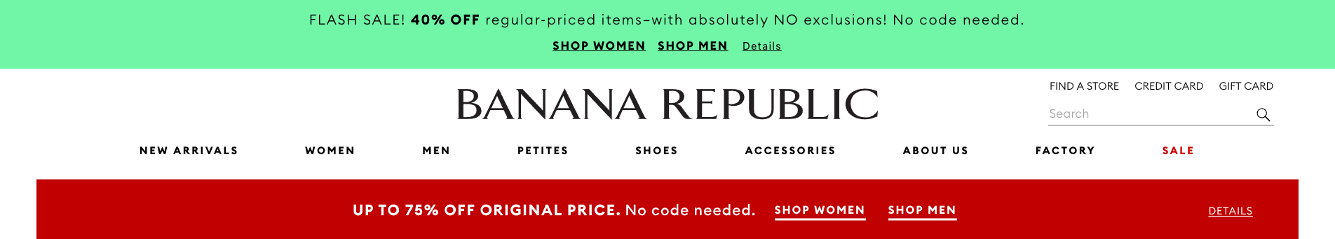
There is a lot going on here, much of which can be stripped as it’s either superfluous of conflicts with the company brand. There is no need to announce a flash sale—the rest of the header clearly advertises a discount, and the wording goes betrays the air of high quality the brand wants to exude. Formal language like “exclusions” derails any attempt at a casual tone, as does the stilted, incomplete phrases. There is also incongruence: the “Shop women” and “Shop men” links in both banners serve a purpose, but there’s similar links in the main menu. If the main menu can have simple “Women” and “Men” with no need for a prefix, why should anywhere on the page need them. After all, isn’t it implied all of the links lead to something shopping related?
Here is my improved header:
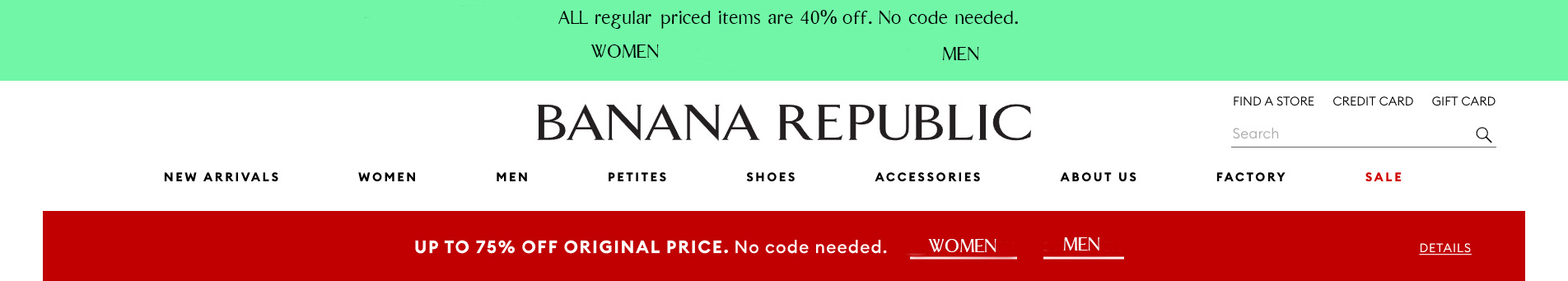
I changed the sentences to a more conversational English, removed superfluous words, and removed the flash sale language, letting the rest of the sentence do the heavy lifting.
Newsletter
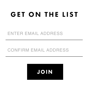
Perhaps the stylistic opposite of the masthead, the mailing list form is spartan to a fault. It doesn’t explain what it is you’re signing up for—is it a list of preferred customers? A list for product testers? —and even worse, doesn’t give the customer any reason to bother signing up at all.
Here is my improved newsletter signup form:
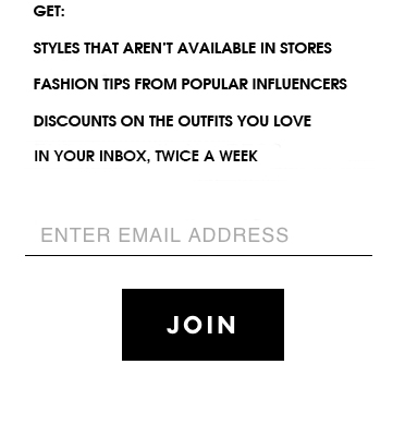
I included reasons to sign up for the mailing lists, with the features unique to the site on top, with the ubiquitous “exclusive deals” language last on the list. I also mentioned how often the customer would be receiving email, to allay their fears of constant spam. I also removed the field to confirm the email dress, removing a redundancy that might cause users to skip signing up.
Sign In/Register Page
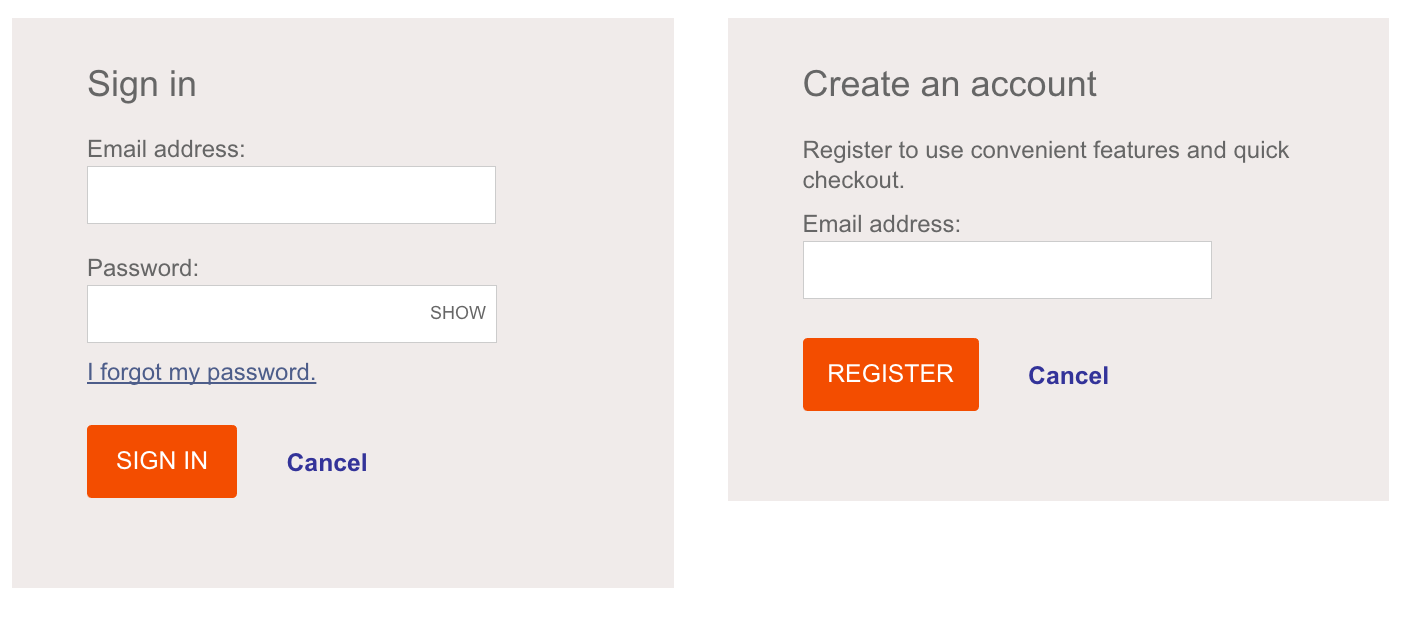
Again, generic pages that don’t do much, if anything, to convince the user to take the time to sign in or to create a new account. It is also too formal for the casual tone the brand wishes to represent.
Here is my improved version of the sign in and register forms:
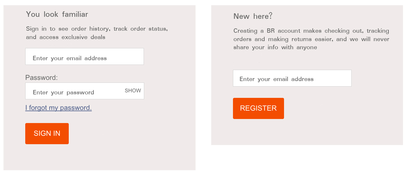
Overly formal, cold language is replaced with a warm conversational dialog. No longer is the user presented with a command; a choice is given, along with the information (why am I signing in or registering, exactly?) to make that decision. I also remove the cancel link because it is superfluous: these forms are already on the home page, the same page to which the link redirects the customer.
404 Page
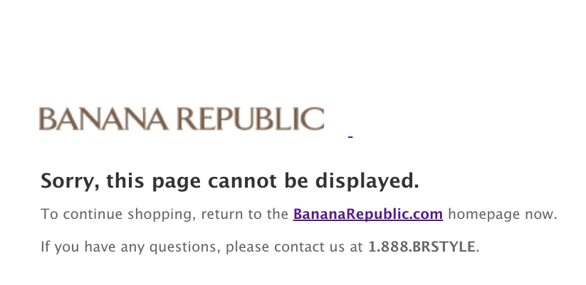
This page is obviously thrown in as afterthought. The generic “page cannot be displayed” language simply isn’t good enough for a brand that wishes to portray itself as knowing but cool, and that customers hope will make them look cool. There is nothing cool about this page. We can fix that:
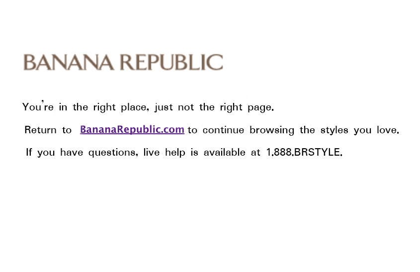
My improved 404 page uses a little bit of humor, but not in a way that makes the customer feel unwelcome or ignorant. It also gives customers a reason to redirect back to the homepage, rather than exiting in frustration. And it informs site browsers that live help is available, if needed, over the phone.
